RIPPLE ENERGY - responsive website
The Challenge
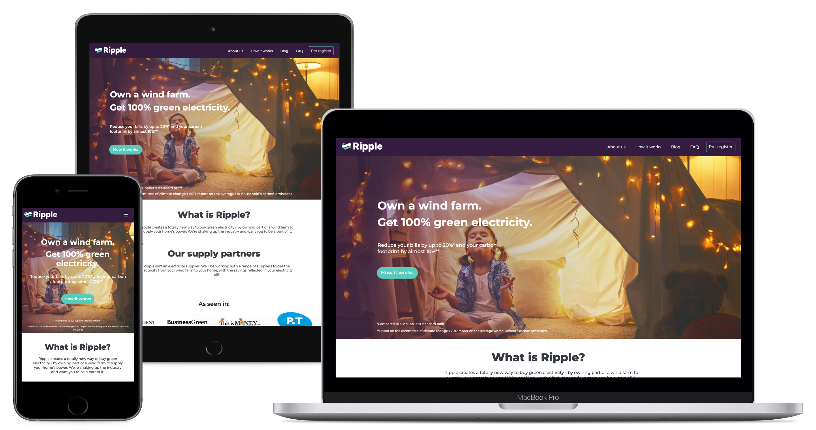
The project objective was to create the first B2C responsive platform (Website, Account creation and Dashboard) which allows people to calculate their wind farm ownership based on their electricity demand, choose an affordable tariff with Ripple's supply partners and cooperatively own a wind farm with other members.
This also involved designing their MVP features, building the company Design System, deliver prototypes to show case features, user testing and overall optimization of the UX/UI design.
To comply with my non-disclosure agreement, I have omitted and obfuscated confidential information in this case study. All information in this case study is my own and does not necessarily reflect the views of Ripple Energy.
My Role
Solo Product Designer
In addition, I worked alongside a Brand Creative Lead, a Marketing Director, a Product Manager, a Graphic Designer and a Web Developer.
I was part of the ambitious project of designing Ripple Energy website
The website was launched globally on the 4th of November 2019.
Read the detailed - Full Case Study (pdf)
Tools
Whiteboard - Pen and Paper - Adobe XD
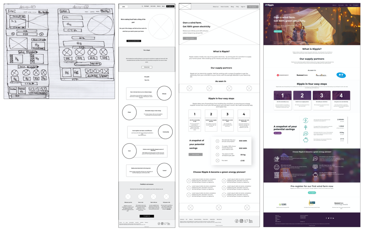
Wireframing

Progressive iterations of the landing page from low-mid to high fidelity wireframing
Usability Testing
As a team we decided to:
- collect data from Google Analytics and Hotjar;
- conduct A/B tests and desirability testing with 5-7 participants for the website landing page.
We aimed to understand if the landing page was effectively communicating the intended message and improve the overall website usability, navigation and interaction, through capturing accurate data on user behaviours.
Insights
User testing helped us to validate our designs choices and prioritize further iterations to improve business and product targets. Our priorities focused on:
- reinforce the benefits of joining Ripple Energy to increase user engagement;
- clarify the different costs/payments to Ripple Energy and to the supply partner;
- review and concise the content of the pages and improve UX.
For confidentiality reasons I have omitted the actual values for these metrics.
Final Designs

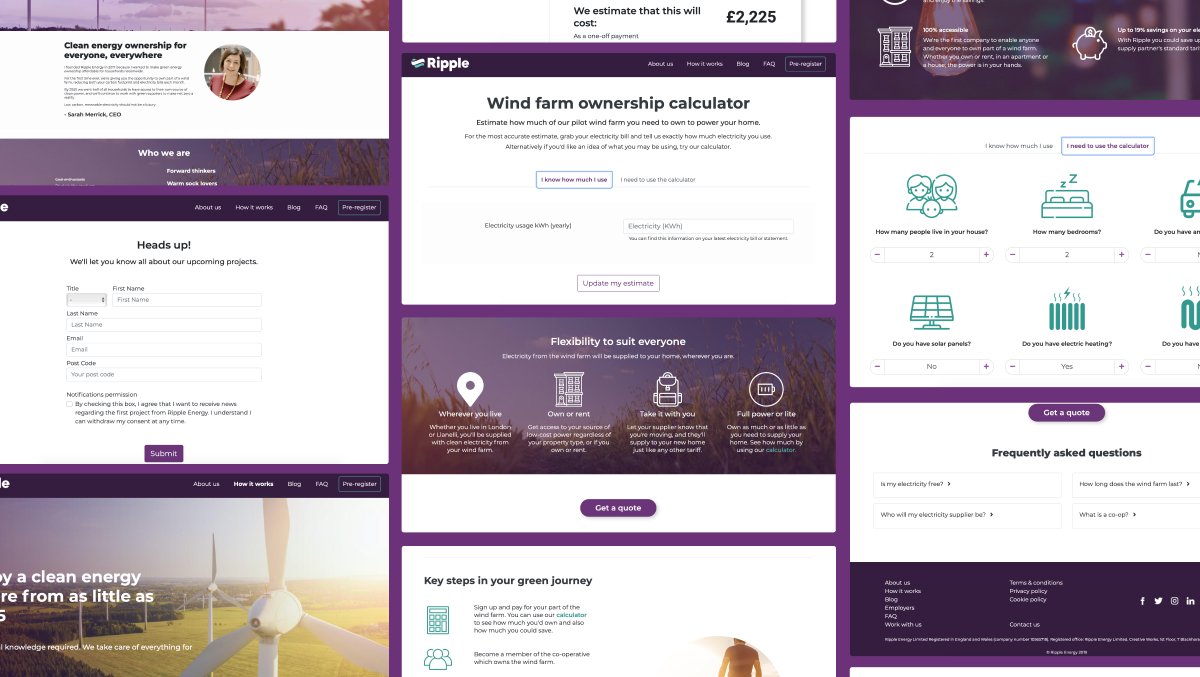
Key Changes
- all the content was reviewed aiming to achieve clear and concise information;
- font was changed to Montserrat to achieve better readability;
- one unique UI design for the CTA button “Get a quote” to be easily identified by the user and trigger action;
- specific and tailored FAQ’s were added to the end of the pages;
- overall improvement of accessibility throughout the website was made;
- UI design throughout the website was changed;
- I created a Style Guide and a Design System.
Takeaways
It was great to be able to be part of the beginning of this project. It was a complete design and built from scratch.
Ripple Energy offers a unique product which on itself is very challenging. It was highly important to build a platform, as easy and pain-free as possible for the user whilst ensuring consistency across platforms.
It was a very enriching experience to build the first Design System of the company. This aimed to ensure consistency for the evergrowing product and significantly improve the team's efficiency.
I've learned a lot from this project by working alongside an experienced and diverse team. From establishing processes and ways of working, receiving feedback and making informed design decision to understand customer journeys that helped me to uncover new problems to solve and ultimately build a better product.
Read the detailed - Full Case Study (pdf)