VOCAB... mobile app
About
This was a project I completed as part of the UX Fundamentals course with Career Foundry.
My role was to research, design and test all UX related to the project.
Vocab is a new app to improve languages skills and can be used to study vocabulary and improve speaking skills anytime and anywhere.
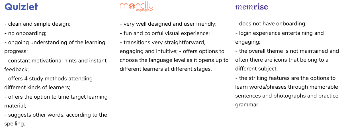
Competitive Analysis
User Personas

Emmet F.
Male, 27
Irish, based in London, UK
Single, no children
Science Teacher
Speaks Irish, English and Spanish (A2)
"My biggest concern is to be understood and be able to understand others, and to have enough vocabulary to make at least small talk."
NEEDS
to be able to communicate effectively with others. Not only to understand the words in context, but also improve his writing, listening and speaking.GOALS
to live in Spain, so is looking to improve is Spanish to a proficiency level.CHALLENGES
a busy schedule, being always under pressure at work and spending a lot of time in transport. He needs an empowered, time effective and fun tool that allows him to learn and improve his Spanish anytime and anywhere.BEHAVIOUR
works in a primary school, busy and under pressure. Uses public transport. He is taking an A2 Spanish course, using several apps to learn vocabulary. Keeps record of new vocabulary and grammar in a notebook. Regular traveler to Spain. Socially very active. Avid listener of podcasts.PROBLEM STATEMENT
Emmet needs a way to hear the correct pronunciation of the words, because he wants to be confident that native people understand him correctly.
HYPHOTHESIS STATEMENT
We believe that by creating a speaking option by a native speaker of a language who articulates the words for Emmet, we will achieve that his communication levels in speaking will increase dramatically.
Information Architecture
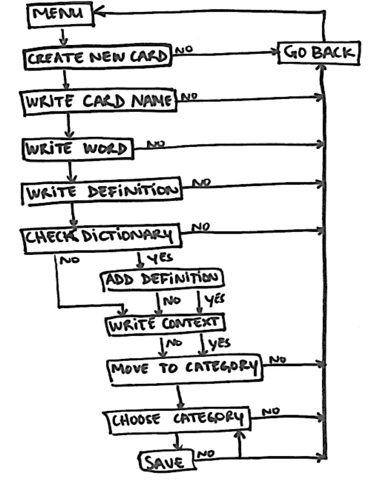
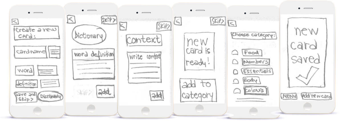
Task Analysis 1 - Card Creation
Entry point: Menu
Success Criteria: Create a customized word card
- Click on Create New Card button
- Write card name
- Write word
- Write definition
- Check dictionary
- Add definition
- Write context example
- Click on Move to Category
- Choose Category
- Save
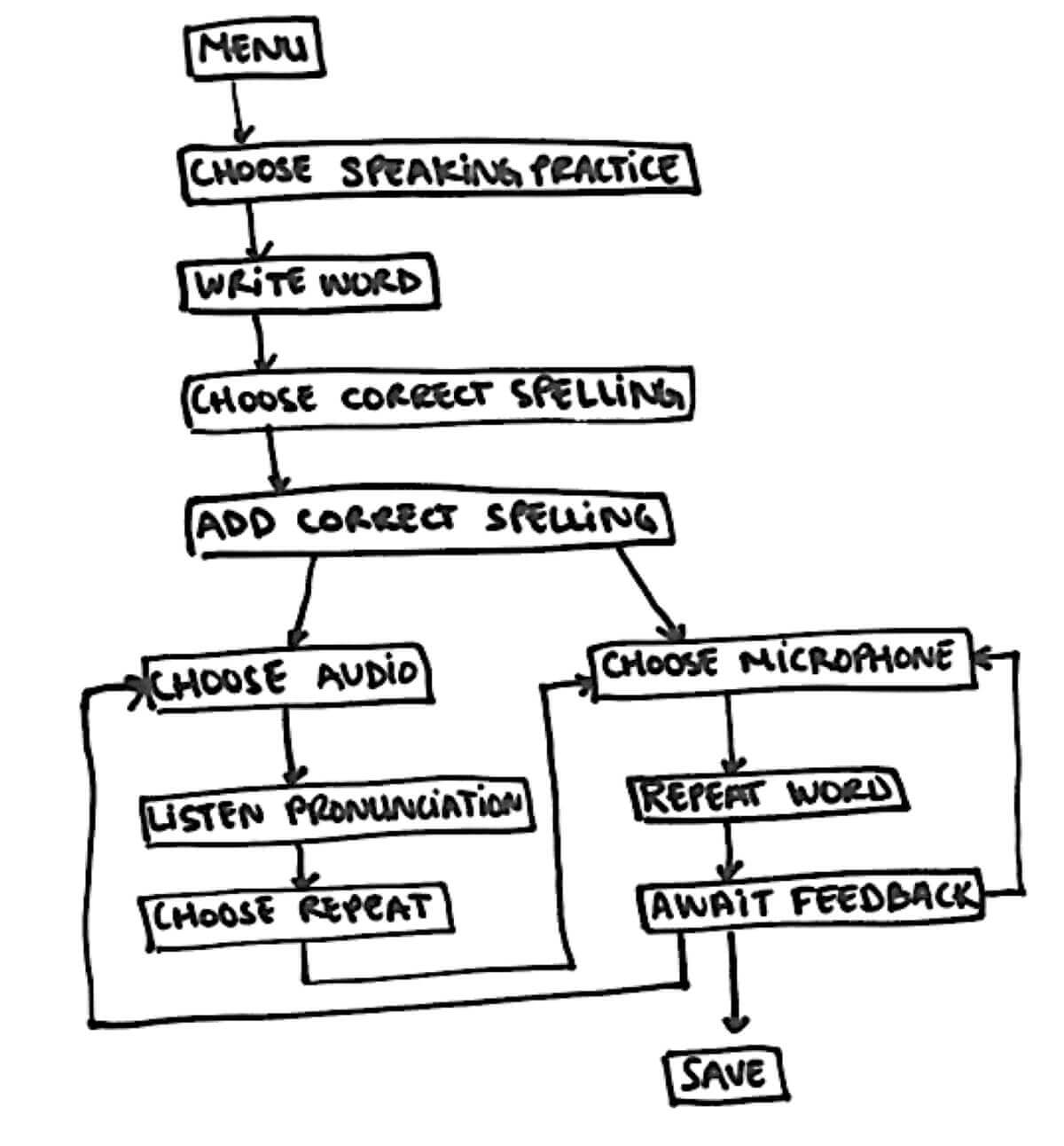
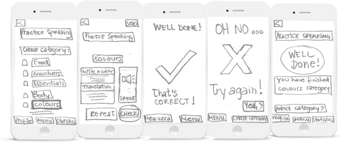
Task Analysis 2 - Practice Speaking
Entry point: Menu
Success Criteria: Complete a speaking session
- Click on Speaking button
- Write word/phrase
- Click Check Spelling
- Click Audio button
- Listen pronunciation by native speaker
- Click Micro button
- Voice the word/phrase
- Check feedback on pronunciation and errors
- Click Repeat
- Save
Wireframing & Prototyping
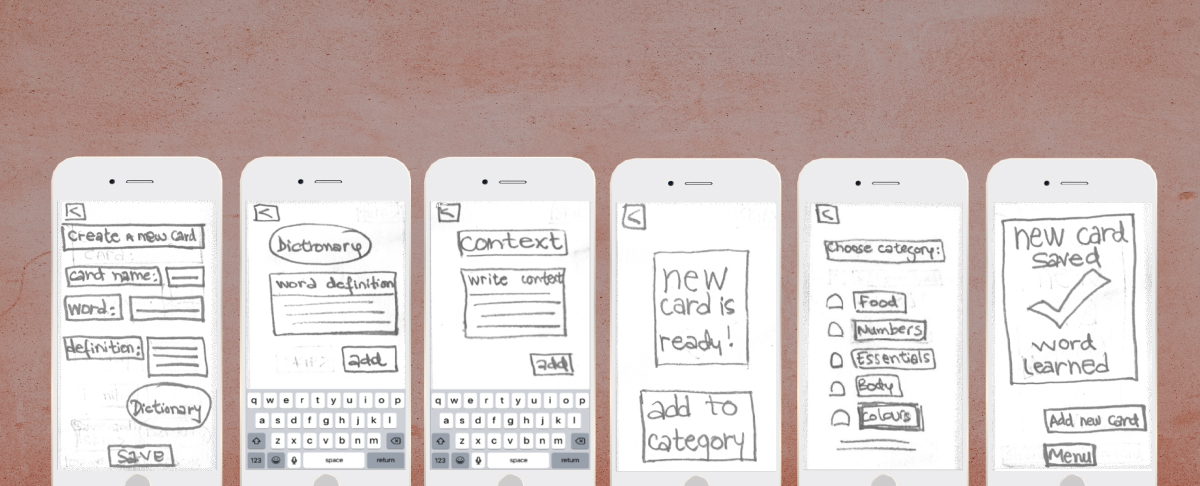
The next step was developing low-fidelity wireframes and prototypes so the users could interact with the product and test it.
Usability Testing
Users tested the working prototype and gave feedback on the usefulness and usability of the app and iteratons were made. Additionally identify areas of improvement pain points and how easily the user is able to navigate through the app.
I identified a few issues that came up during the tests:
Specific Problem 1- Card Creation
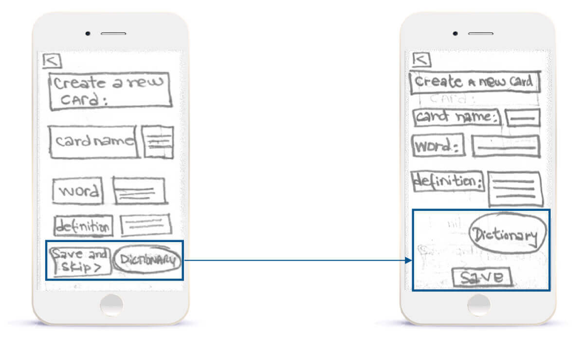
Buttons at the same level caused confusion
- “Save and skip” button is confusing for the users, as a one only button. Additionaly, by being at the same level as the “dictionary” button, this adds doubts to the user about the priority of actions.
- Therefore, i have created the “save” button as a call for action buttom on the bottom of the screen.
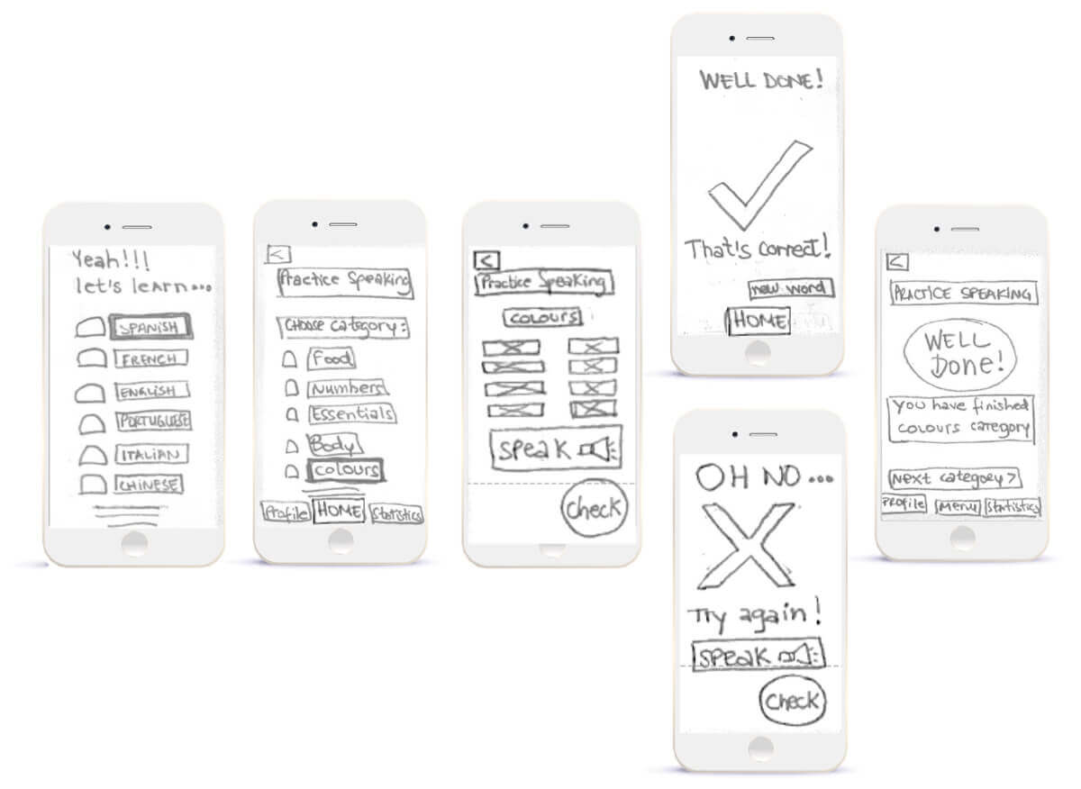
Specific Problem 2- Practice Speaking
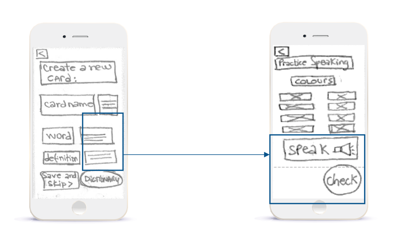
Users are confused with the flow
- Structure was confusing and not in the right order.
- So I re-structured the categories by offering word options to be practiced. Additionally, I moved the “Speak” button to the end of screen followed by the “Check” button.
Final Design
Card Creation

Practice Speaking
Takeaways
This project dived deep into my focused interests of user research and user testing. These were crucial to understanding the needs and goals of potential users which helped me to validate my design choices.
By using low fidelity wireframes and prototypes, I was quickly able to obtain user feedback without spending a lot of time and resources.
Moving further, I would have liked to spend some time:
- Building into high fidelity wireframing and prototype;
- Creating a succinct brand and design language;
- Conducting more user testing to validate the solutions.